|
Are you tired of seeing mixed messages on social media regarding the novel coronavirus? Even if you aren't a programmer, you can use data science techniques to analyze the real data and get answers for yourself. In this article I will provide step by step instructions on how to do it. Russell J. Gray - 02/12/2020 I would first like to thank Patrick Tung for his blog post providing R code and and Dr. Yu for creating the new nCov2019 package, I have provided necessary links to their respective work at the bottom of this article. Step 1. download R and R studios (FREE) R is a programming language similar to Python, and is used widely by data scientists and ecologists. R studios is the Integrated Development Environment (IDE) that allows you to conveniently visualize your data, figures, and maps in the R environment itself. Get R: https://cran.r-project.org/bin/windows/base/ Get RStudios: https://rstudio.com/products/rstudio/download/ Step 2. download and run this R file line by line
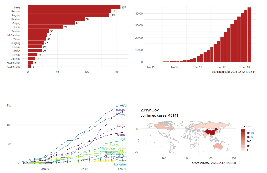
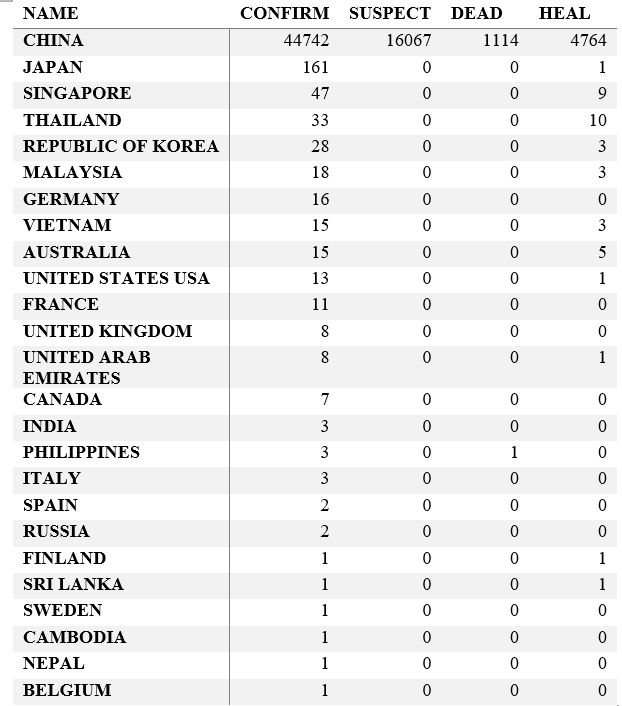
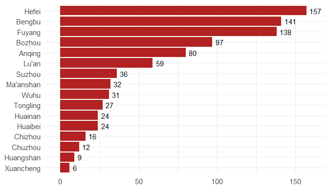
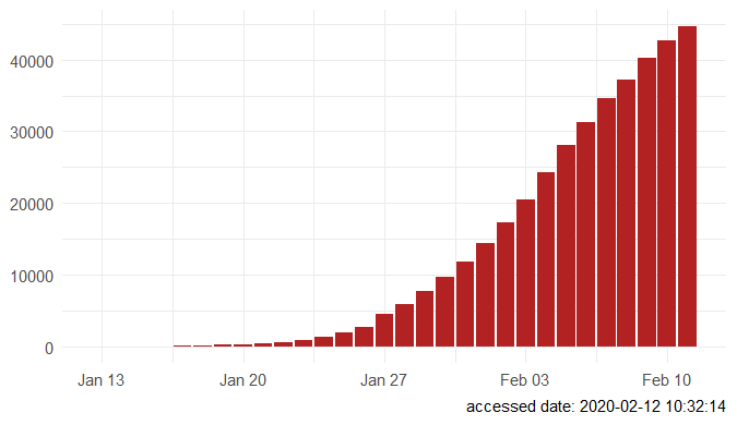
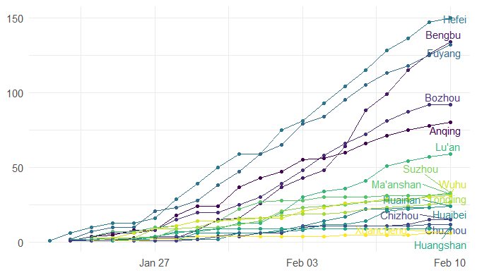
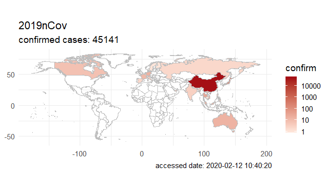
Step 3. Explore the data and figures The first thing you will do is install the necessary package that provides the functions to query nCoV data. The first function get_nCov2019(lang='en') pulls all data from the self-updating database in English. By storing it in an object "x", which is just a container for the data, you can name it whatever you'd like, we can view the count of total confirmed cases in China and the last time the count was updated. China (total confirmed cases): 44742 last update: 2020-02-12 10:32:14 Next, we can use various options for exploring the data frame itself. By using the code x['global', ] we are calling our data "x" and querying all available data. 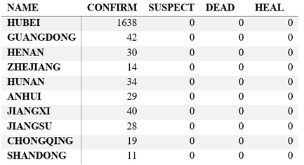 We can also use head(x[by='today'], 10) to subset data from our query and only view the first few data records from the current day. This will appear in descending order, in this case throughout China. Now, there are several methods in the code file which allow you to explore by country, province, and even city; however, for visual learners, plotting the data will make it much easier to interpret. We do this by using the ggplot2 package, and forecats package as a supplement for organizing time series the data. We can use the built in plot() function with the data of our choice to plot a chloropleth heatmap of affected areas globally, or we can use ggplot() with various bars and columns to represent either time series data, or overall data. Figures generated in R. (top left) confirmed cases by City in China; (top right) cumulative rate of confirmed cases of nCoV between January and February; (bottom left) cumulative rate of confirmed cases in cities of Anhui province, China; (bottom right) chloropleth world map showing hotspots based on confirmed cases of nCoV by country. The main point I want everyone to take away from this, is that there is vast amounts of open-source data online, free to the public. If you take a few moments to learn a small amount of a coding language like R, you never have to guess which sources are reputable or believable, you can look at the raw data yourself, organize it, and draw your own conclusions. Scientific literacy is important for each of us to make informed decisions, and with current misinformation which spreads through social media platforms like wildfire, we sometimes feel overly skeptic. Learning to analyze data yourself removes the middle-man, as it were, and allows you to take control of the truth. References
https://mp.weixin.qq.com/s/lrQWGKj-mReWrxfi_4Sw9A https://mp.weixin.qq.com/s/bPXdOGFzFK5dWLTEOEJB3g
3 Comments
Cornelius Tanui
2/12/2020 06:02:44 am
Quite informative.
Reply
Celso Miranda Santos
2/13/2020 08:39:03 am
Good afternoon Mr. Gray,
Reply
Russell Gray
2/13/2020 08:45:02 am
Hi Celso,
Reply
Leave a Reply. |
AuthorRussell J. Gray Archives
April 2021
Categories |
||||||

 RSS Feed
